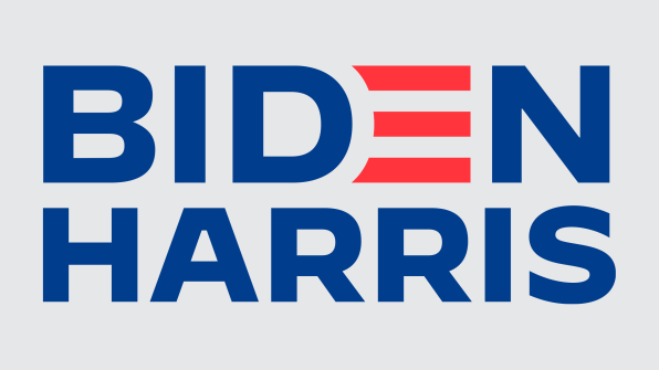
With the selection of Kamala Harris as Joe Biden’s running mate, it was time for Biden campaign (Biden/Harris that is) to role out a new brand. A while back I took a look at the logos of the various Democratic candidates and noted that many of the logos (although neither Biden’s nor Harris’) featured only the candidate’s first name.
Eventually Biden’s team did roll out a first-name-only version of his logo using the same red and white stripes used in place of the ‘e’ in Biden for the ‘e’ in Joe. To me it reads like the name Jo overlaid on a striped background.
Fast Company once again asked a panel of design professionals to weigh in on the new Biden/Harris brand. They note that the font has changed to something heavier. I would call it more aggressive. They also note that to make the justified stacked text work, Harris’ name is in a smaller font than Biden’s. This is atypical. In recent history, only the Bush/Cheney campaign did not treat both candidate’s name in the same point size.
Circling back to my earlier observations about the use of first names, the fact that the new branding includes only last names seems to signal that the campaign is taking a ‘do no harm’ approach to the general election. With a healthy lead in the polls and the need to persuade moderate voters from both parties to get on board, a conservative (with a small c) approach to branding is a good bet.

